CADRE Brand Design
Background: The Australian Data Archive approached me to develop a brand for a new framework they were creating. The framework, known as CADRE, is a digital passport that covers the safe transfer and access of sensitive data, particularly data related to social studies. It was important for the brand to convey feelings of security and safety, while also being friendly and bright.
Challenge: The main challenge was to create a brand identity that effectively conveyed the key values of security and safety, while also being inviting and friendly. Additionally, it was important for the brand to be easily recognizable and memorable.
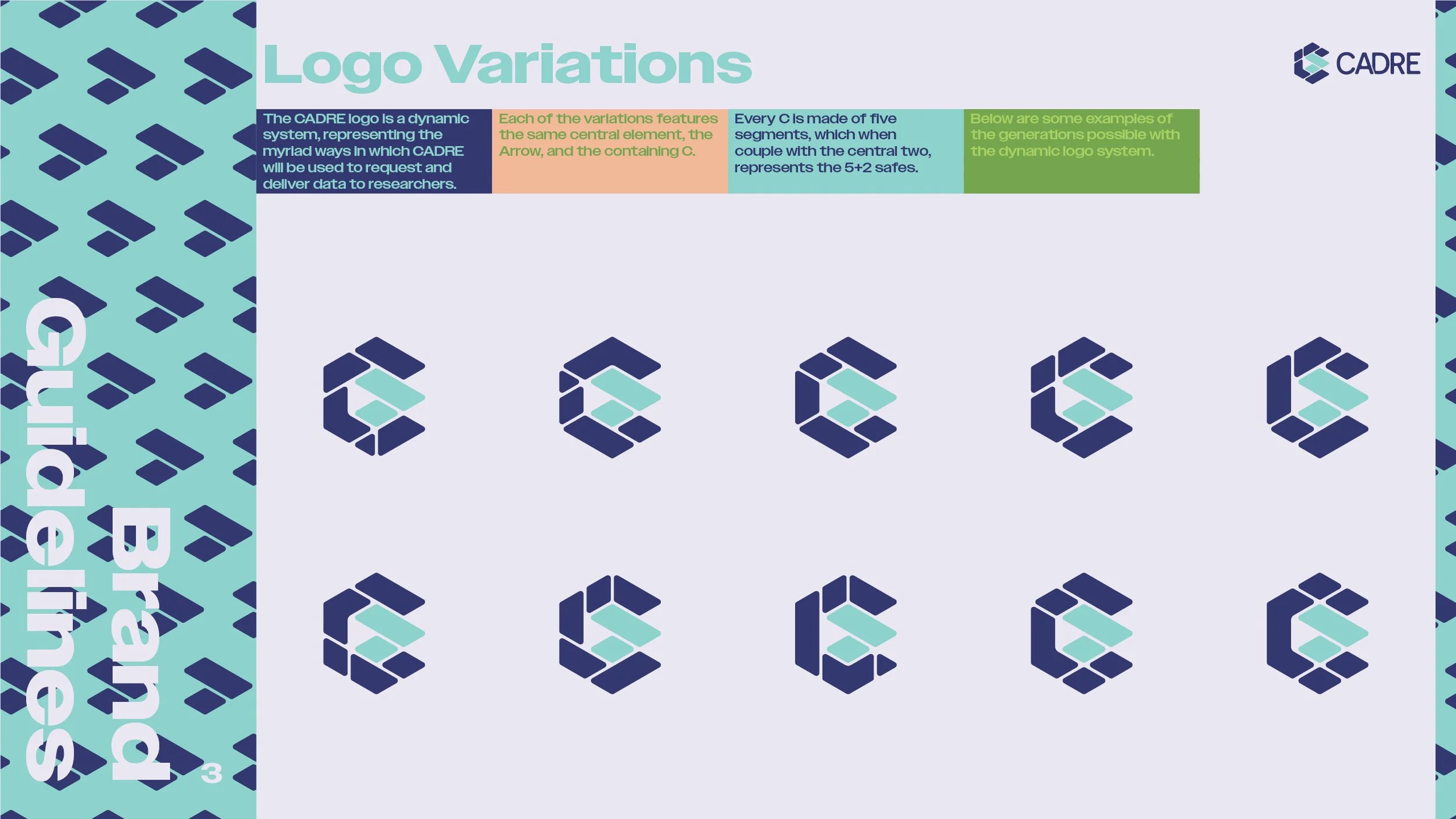
Solution: I worked closely with the Australian Data Archive team to understand the key values of the CADRE framework. I developed a dynamic logo as the core of the brand identity, which was constructed using a triangular framework. The logo was inspired by the Latin meaning of "cadre," which means framework. The logo features a central arrow symbolizing the speed at which the system operates, and a stylised C shape. The C is always made of five segments, and the arrow is made of two. These represent the “Five Safes, plus two”, the Five Safes being an existing framework. The two are unique to CADRE, and are important additions, increasing the safety and security of data transfer and access.
To ensure the brand identity evoked friendly and bright sentiments, alongside the impression of security, I developed a color scheme featuring a deep blue as the primary color with lighter, but still bright pastels as secondary and tertiary colours. The deep blue carries connotations of security and safety, and when paired with the lighter tones, creates an inviting and safe perception of the brand.
I also chose bold typography to continue the work of the logo and color scheme, creating more notions of strength and security, but simultaneously maintaining a friendlier air than would be presented by a geometric typeface. Additionally, I developed icons using a triangular framework similar to the logo to ensure a feeling of similarity across each of the icons, as well as carrying on the sense of order and security that the logo features.
Results: The CADRE Brand Identity was well received by the Australian Data Archive team and has been implemented across all materials related to the CADRE framework. The dynamic logo, color scheme, typography, and icons effectively convey the key values of security and safety while also being inviting and friendly. The brand identity has helped to increase recognition and understanding of the CADRE framework and its key principles.